Dashboards That Drive Strategy

Unifying GA & Backend Data for Cross-Channel Clarity
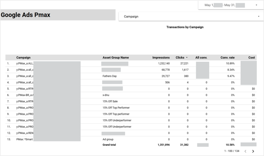
Cracking the Black Box: Unlocking PMax Performance Drivers
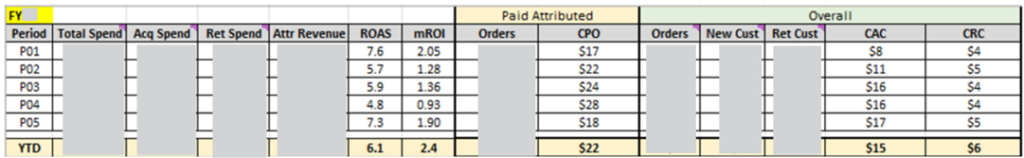
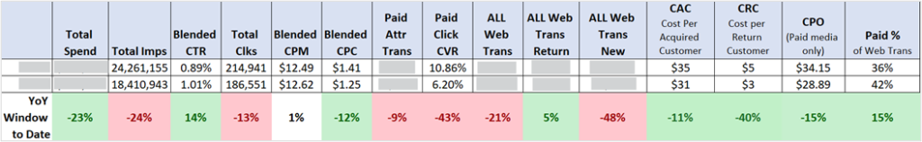
Building CAC & CRC Models to Drive Strategic Decisions
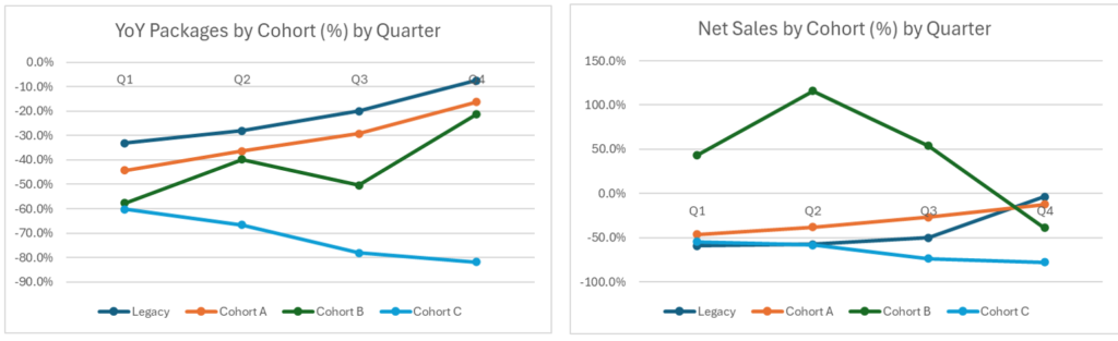
Cohort & Retention Analysis for Long-Term Growth Insights
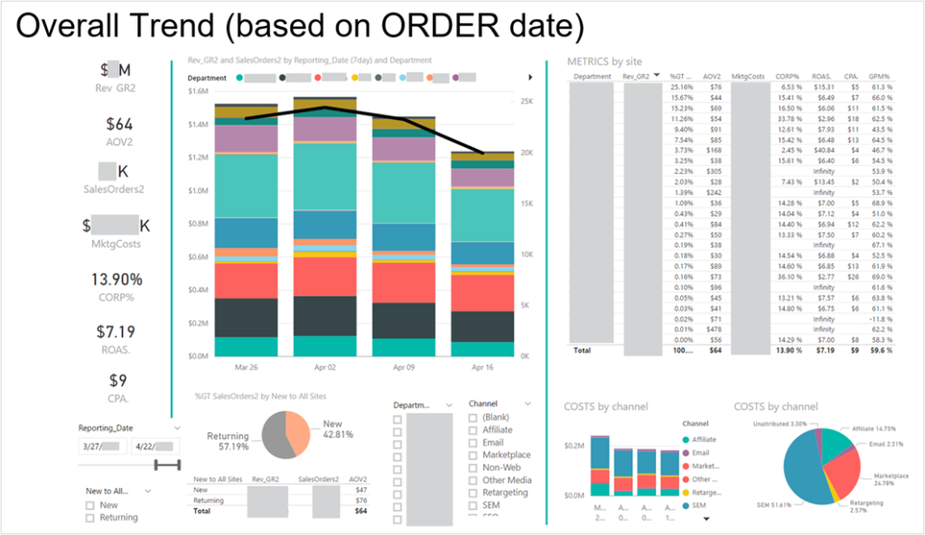
Driving Adoption Through Impactful Data Visualization
Optimizing Media Mix to Drive Brand Consideration
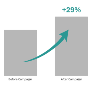
Created Executive Summary Frameworks
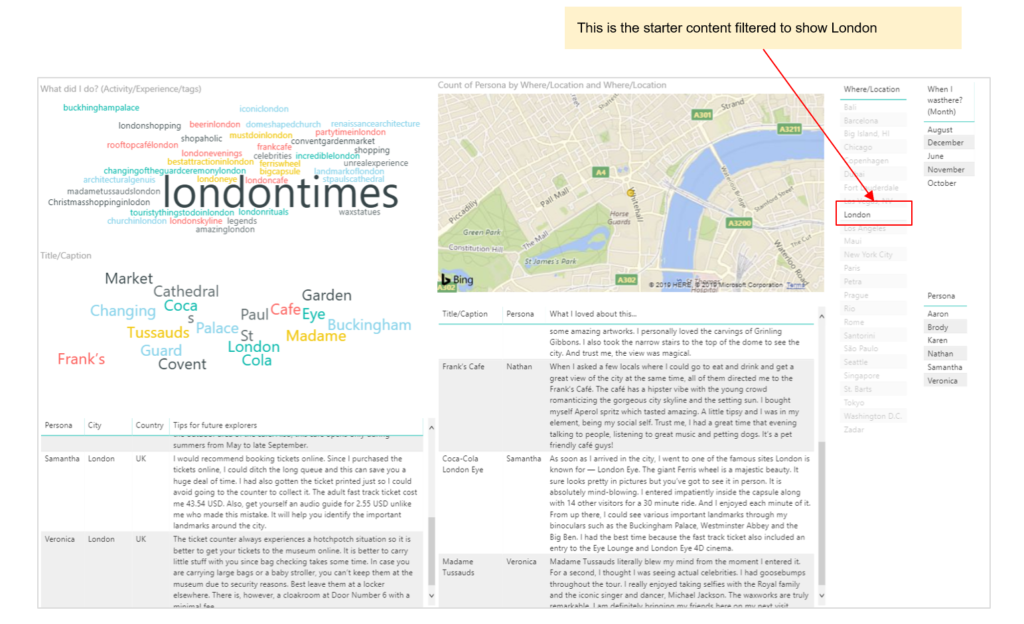
Built Content & Persona Dashboards for UGC Strategy